Therapist websites
Good therapist websites, and the reasons they work.
These four are complete websites for therapists, each built for a fictitious practice so you can see a whole design in use, not a screenshot. Every one is live. The look is what we apply to the site you already have: your pages, your words and your photographs stay, and the design changes.
Four websites for therapists, each built to be chosen.
A private practice, a group practice, a photography-led private practice and a collective. Open the demo, then read what each one gets right.

01 · Private practice
Wrenfield
Warm and editorial, for a private practice.
A therapist in private practice whose site should feel like a good first conversation: unhurried, personal, a little literary.
What it gets right
- One next step on every page, a free consultation, in a button that never competes with anything else.
- The therapist's own words come before the services, so a visitor meets a person before a menu.
- Service rows with real photographs of the office, and rates on their own page instead of hidden.

02 · Group practice
Tidemark
Calm and structured, for a group practice.
A group practice with several clinicians, where the first job of the site is helping someone find the right person.
What it gets right
- A who-to-see-for-what matrix, built from the team's own data, answers the group-practice question in one glance.
- Every clinician has a page in their own voice, and the footer says who is accepting new clients right now.
- Insurance and getting-started pages sit in the main menu, because that is what a new client is looking for.
03 · Private practice
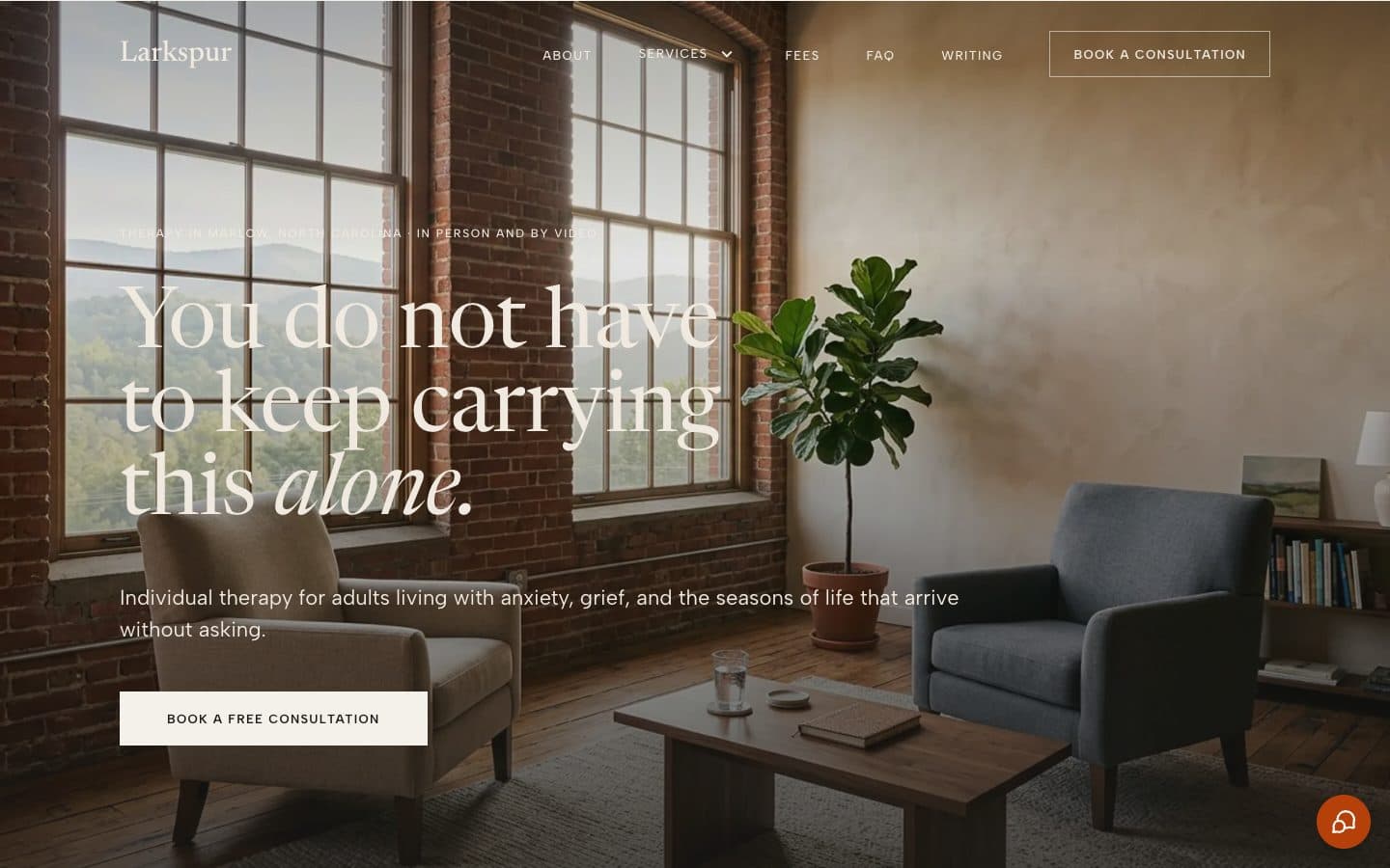
Larkspur
Photography-led, for a private practice.
A therapist in private practice with good photographs of themselves and their office, who wants the space to do most of the talking.
What it gets right
- Photography does the work: the office, the therapist, one full-width moment per page, none of it stock.
- A manifesto before any service, so the practice's stance is clear before the menu of options.
- Square corners, no cards, no shadows: nothing on the page reads as a template.
04 · Collective
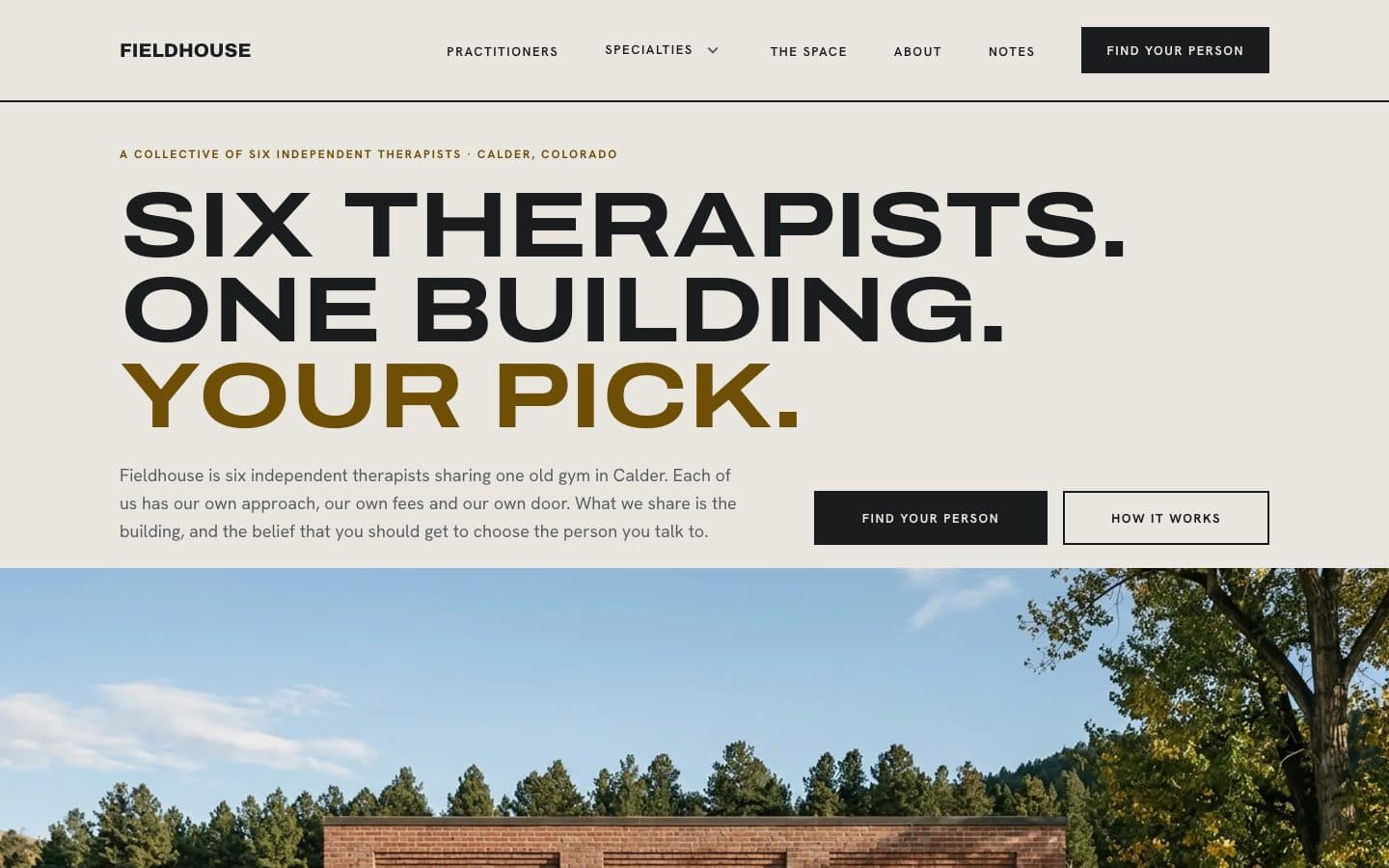
Fieldhouse
Bold and modern, for a collective.
Independent therapists who share a building and a front door, and want a site that helps people choose a person rather than a practice.
What it gets right
- Every practitioner sets their own fees, insurance and booking, and the site says so on every page.
- A "not for you if" line on each practitioner's page names a colleague and their room: honest referral, built in.
- Specialties are listed with who takes them, so a visitor finds the person, not just the topic.
What makes a therapist website good.
The four examples above are judged on these seven things. They are the same seven we hold every site we build to, whether it started from one of these designs or from a practice’s existing site.
01
One next step, the same on every page
A visitor should always know what to do next, and it should be one thing: book a consultation, or write. One button that never competes with two others.
02
The person before the services
People choose a therapist, not a menu. The practice's own words, in its own voice, come before any service is named, and every clinician has a page written as if by them.
03
Real photographs, or none
The office, the therapist, the building. No stock imagery, no filters. A site with two honest photographs beats one with twelve borrowed ones.
04
Fast and quiet
No sliders, carousels, autoplay or parallax. Pages load in well under a second on a phone, and nothing moves unless you scroll.
05
Readable by everyone
Every color pair is checked for contrast before it ships. Text never sits on a photograph without a scrim. Headings are headings, links look like links.
06
Forms that respect the situation
Contact forms ask for a sentence, not a history, and say plainly what happens to it. A crisis line appears on every page that invites someone to write.
07
Readable by AI, too
Structured data on every page describes the practice, the people and the services, so ChatGPT, Perplexity and Google can recommend it by name.
We don’t sell therapist website templates. We apply the look to your site.
A $299 template hands you a folder and a to-do list: build the pages, write them, find the photographs, keep the plugins updated, and hope the form works. Most therapists get halfway.
Here it runs the other way. You keep the site you have, or we start you from one of these four. We apply the design to your content, your domain and your photographs, and an AI assistant keeps the site running, updated and found. From $99 a month, no setup fee, no contract.
If one of these looks like your practice, the next step is a short call, not a download.
Questions about these websites.
Are these real therapy practices?
No. Wrenfield, Tidemark, Larkspur and Fieldhouse are fictitious practices we built so you can see a complete design in use, with every page, rather than a mock-up. The designs are real and every demo is live. Nothing on them is clinical advice, and their contact forms don't send anywhere.
Can I get one of these designs on my existing site?
Yes, that is what they are for. Each one is a style directive: we apply its type, color, spacing and page structure to the site you already have. Your pages, your words and your photographs stay; the look changes. We do it, you don't.
Do you sell therapist website templates?
No. A $299 template leaves you to build the site, write it, and keep it running. We build and run the site for a monthly fee, and these four designs are the looks we apply. If you like one, the next step is a free consultation, not a download.
What makes a good therapist website?
One clear next step on every page, the therapist's own words before the services, real photographs, fast pages with nothing moving, contrast that everyone can read, forms that respect a nervous first-time visitor, and structured data so AI assistants can recommend the practice. Each example above is judged on exactly those.
Which design is right for a group practice?
Tidemark was built for a group: the team is the first thing you see, a who-to-see-for-what matrix answers the group-practice question in one glance, and every clinician has a page. Fieldhouse is for a collective of independent practitioners who share a building but not a fee or an intake.
Can I see them on a phone?
Open any demo on your phone; they are real sites. Each example page here also shows the home page at phone size.
See one of these on your own site.
A free consultation: we look at your current site, pick the design that fits, and show you what it would look like with your content.